Physical Address
304 North Cardinal St.
Dorchester Center, MA 02124
Physical Address
304 North Cardinal St.
Dorchester Center, MA 02124

If you’ve opened ChatGPT’s image tool, typed something vague like “a nice product photo”, and got back something that looks… fine but forgettable — this is for you.
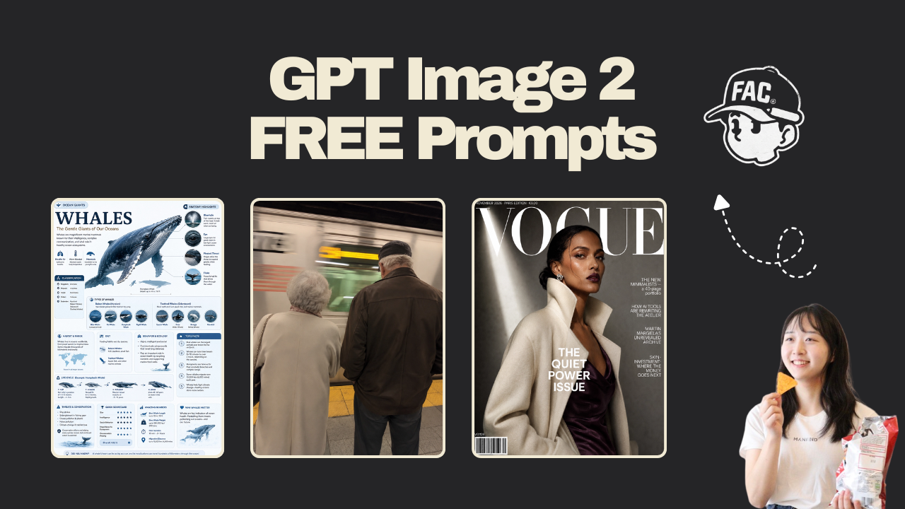
GPT Image 2 is OpenAI’s newest image model, released in April 2026. What makes it different from what came before: it follows complex instructions. You can describe 10 specific things in one gpt image 2 prompt and the model will include most of them. Text inside images is legible. Styles hold up. The gap between what you ask for and what you get is much smaller than it used to be.
The catch is that most people don’t know what to ask for. They type a sentence. They get something generic. They assume AI image tools aren’t that impressive.
Every prompt in this post comes from an open-source gallery of 162 tested gpt image 2 prompts built by the community. They’re not magic words. They’re just specific. Paste them directly into ChatGPT (with the image generation feature switched on), see what comes out, then tweak one detail to make it yours.
This is Part 1 of an ongoing series. Each part covers a different set of use cases.
Shout out to the original source of these prompts 👉 https://github.com/wuyoscar/gpt_image_2_skill#gallery-infographics-field-guides
1. The encyclopedia field guide
Best for: marketers, educators, content creators making shareable social posts.
This gpt image 2 prompt builds a full reference infographic around any topic you choose. You change one word — the subject in brackets — and the model handles the layout, the callouts, the scoring module, and the educational structure on its own.
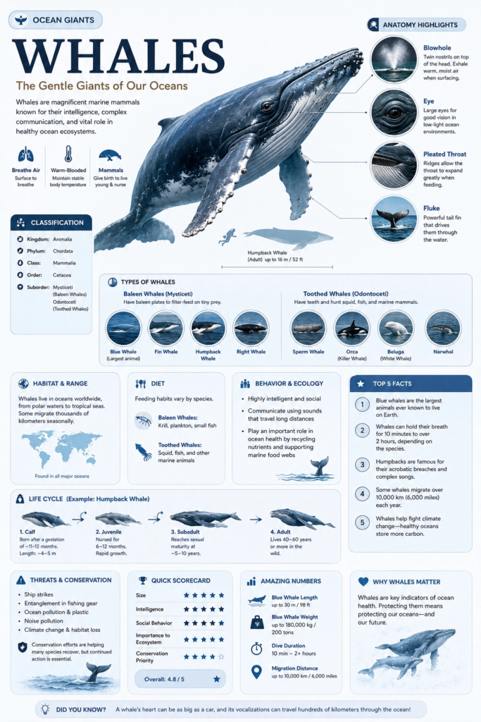
Generate a high-quality vertical encyclopedia-style infographic for [topic].

This should not be a normal poster or a simple illustration. It should feel like a modular educational infographic that combines the clarity of a field guide, the structure of an encyclopedia page, the polish of a lifestyle knowledge card, and the shareability of a strong social-media explainer.

The image should include:
- a clear and appealing main visual of the topic
- several enlarged detail callouts
- multiple rounded modular information sections
- strong title hierarchy and highlighted key labels
- concise but information-rich educational content
- visual scoring, quick takeaways, or a Top 5 module

Adapt the content sections automatically based on the topic. Useful categories include: basic profile, classification, appearance, habits or ecology, formation mechanism or structure, growth or usage conditions, care or maintenance advice, risks and cautions, suitable users or use cases, pros and cons, and a quick scorecard.

Visual requirements: use a clean light background, soft colors, subtle shadows, refined small icons, rounded information cards, and neat layout. The information density should be high but not crowded, and the final image should feel publishable, collectible, and repeatable as a knowledge-card format rather than an advertisement.

Do not make it look like a commercial promo poster. Emphasize knowledge organization, modular information, and a field-guide presentation.
One tweak to try: Replace [topic] with anything — a coffee brewing method, a productivity tool, a fitness concept, a product category. The model figures out what sections make sense for each one.
2. The product photography render
Best for: marketers, small business owners, e-commerce sellers.
This gpt image 2 prompt uses a JSON-style structure. You don’t need to understand JSON — just paste it as-is. The format tells the model to treat your product like a commercial shoot with specific lighting, gravity, and particle effects. The output looks like something a studio photographer charged a day rate for.
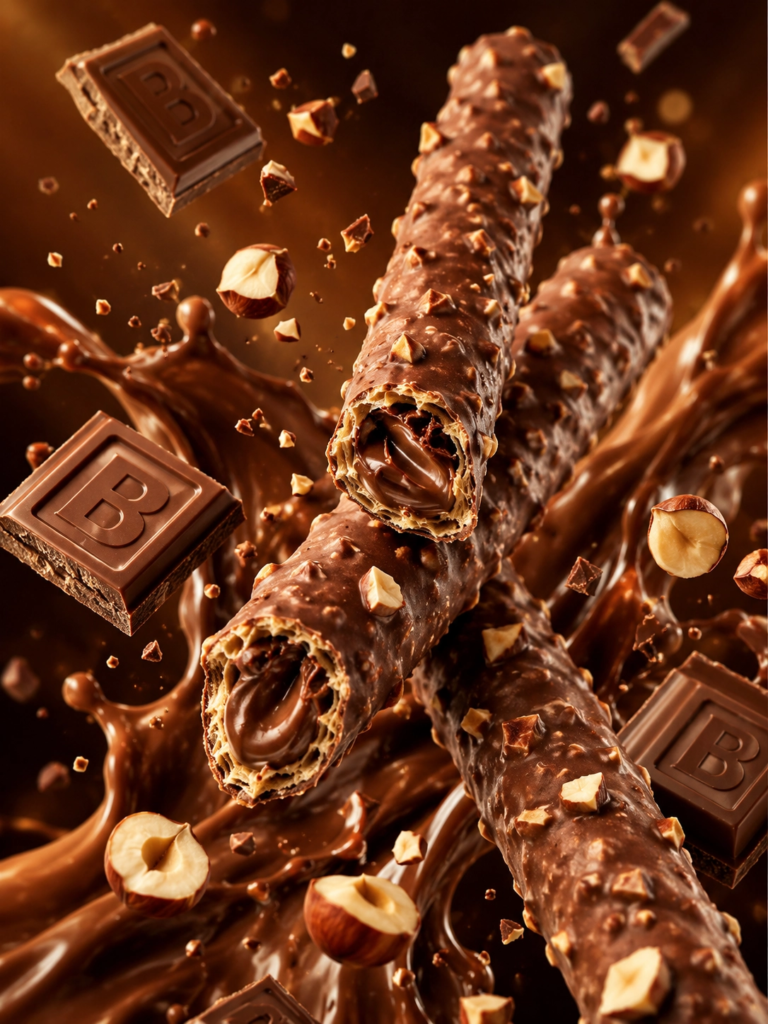
/* PRODUCT_RENDER_CONFIG: Chocolate Wafer Hazelnut Edition
   VERSION: 2.0.1
   AESTHETIC: Premium Commercial Food Photography */

{
  "ENVIRONMENT": {
    "Background": "Gradient(Dark_Warm_Brown)",
    "Atmospheric_FX": ["Floating_Particles", "Depth_Blur", "Cinematic_Bokeh"],
    "Lighting": { "Type": "Directional_Studio_Warmer", "Highlights": "Specular_Glossy_Reflections", "Shadow_Softness": "High" }
  },
  "CORE_ASSETS": {
    "Primary_Subject": "Wafer_Rolls",
    "Physics": "Zero_Gravity_Diagonal_X_Composition",
    "Material_Properties": {
      "Outer": "Milk_Chocolate_Coating",
      "Surface_Texture": "Irregular_Nut_Clusters_Embedded",
      "Interior_Cross_Section": { "Structure": "Crispy_Hollow_Wafer", "Core": "Silky_Chocolate_Cream_Filling" }
    }
  },
  "PARTICLE_SYSTEMS": [
    { "Object": "Chocolate_Blocks", "Detail": "Rectangular_Embossed_Letter_B", "State": "Floating" },
    { "Object": "Hazelnuts", "State": "Halved_and_Fragmented", "Distribution": "Random_Orbit" }
  ],
  "FLUID_DYNAMICS": { "Element": "Chocolate_Splash", "Behavior": "Dynamic_Backdrop_Flow", "Viscosity": "Thick_Glossy" },
  "RENDER_OUTPUT": { "Resolution": "8K_UHD", "Aspect_Ratio": "3:4", "Quality_Flags": ["Hyper_Realistic", "Sharp_Foreground", "Indulgent_Mood"] }
}
One tweak to try: Change "Primary_Subject": "Wafer_Rolls" to your product. Update the material properties to match what your product actually looks like. The JSON structure stays the same and still works.
3. The fake photograph
Best for: content creators, social media managers, anyone who wants a realistic-looking visual without a camera.
This gpt image 2 prompt produces something that genuinely looks like a candid iPhone photo — grain, motion blur, imperfect focus, handheld shake included. It’s one of the clearer demonstrations of how far photorealism has come.
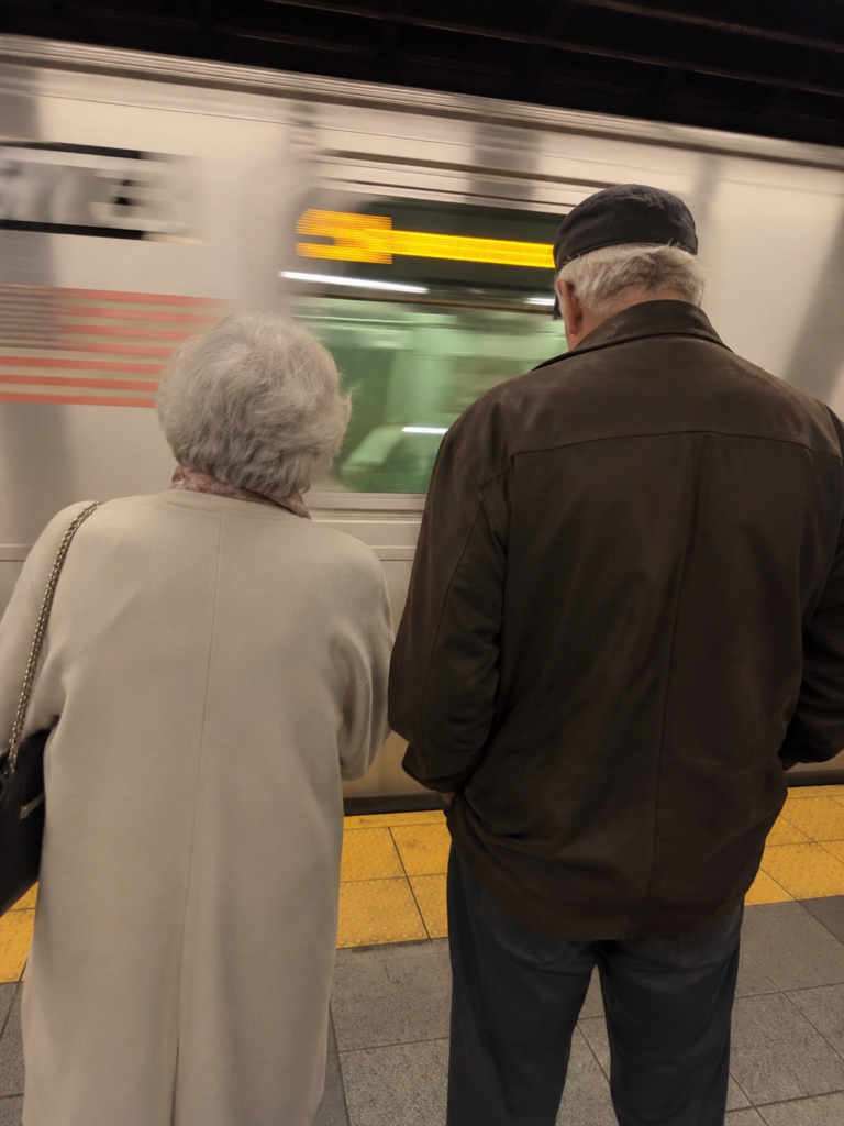
Create a completely RAW quality, unprocessed, unedited image with full iPhone camera quality. A subway station in USA, a momentary blur. The subway is in motion. In front of the subway, there is an elderly woman and man.One tweak to try: Swap the location and subjects. “A night market in Tokyo, motion blur, a street food vendor in the foreground, handheld, slightly overexposed” works just as well.
4. The gameplay screenshot
Best for: anyone who wants to see what a gpt image 2 prompt can do in two sentences.
These are the shortest prompts in this list. The outputs are also some of the most surprising. The model knows what GTA 6 looks like. It knows what a Hitman level looks like. You don’t have to explain it.
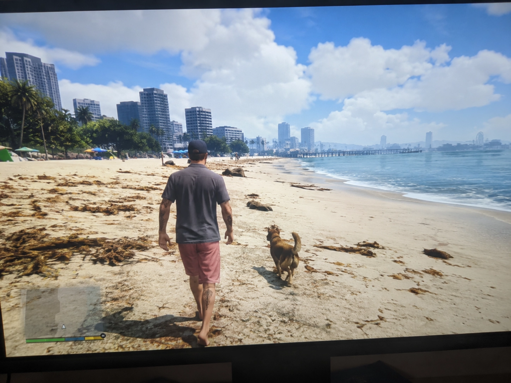
GTA 6 in-game footage, very detailed, very realistic. Close-up shot taken from a stationary 4k monitor. (There's a slight blurriness in the image, as it feels like it was taken handheld). A wide, bright environment. Realistic details. The character is walking on the beach with a dog.Or try this version:
A Hitman level where you are in the OpenAI HQ and your mission is to steal GPT-6 without getting caughtOne tweak to try: Swap the game name and scenario. The model understands game aesthetics across many franchises, so “Minecraft but photorealistic, a player standing at the edge of a cliff at sunset, in-game HUD visible” also works.
5. The magazine cover
Best for: personal branding, content creators, marketers who need high-design visuals.
Text rendering used to be the thing AI image tools couldn’t do reliably. GPT Image 2 mostly fixes that. This prompt produces a magazine cover with a readable masthead, date line, cover lines, and barcode. All of it specified inside the prompt, all of it legible in the output.
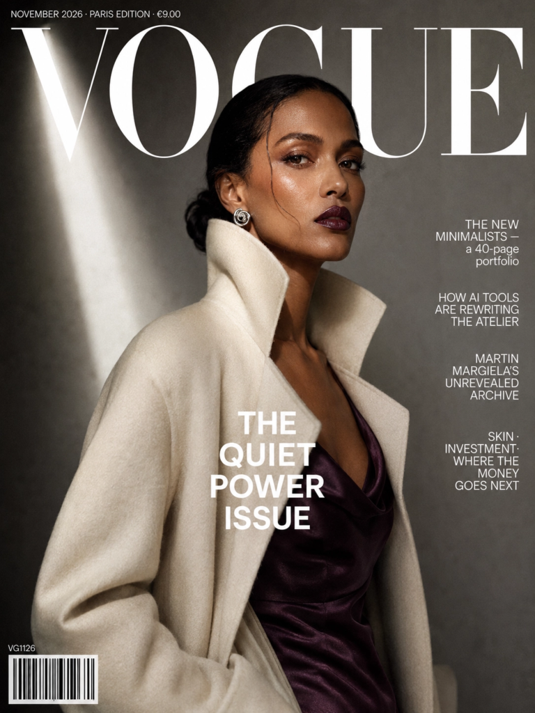
A high-fashion magazine cover, 3:4 portrait, Vogue Paris / British Vogue editorial aesthetic.

Subject: a tall female model, medium-dark skin tone, mid-thirties, standing three-quarters to camera, direct piercing gaze. She wears a sculptural high-collared ivory wool coat over a silk slip dress in deep aubergine. Minimalist silver spiral earrings. Hair in a sleek low chignon with a single escaped strand. Makeup: matte bronze-warm, glossy plum lip.

Background: muted concrete-grey seamless paper backdrop, vertical shaft of cool daylight from upper left. Shallow depth of field.

Exact cover typography (all English, crisp, correctly spelled):
- Masthead, huge uppercase serif, white: "VOGUE"
- Date strip top-left, tiny caps: "NOVEMBER 2026 · PARIS EDITION · €9.00"
- Main cover line, bold sans-serif centered: "THE QUIET POWER ISSUE"
- Right-edge cover lines, stacked:
   "THE NEW MINIMALISTS — a 40-page portfolio"
   "HOW AI TOOLS ARE REWRITING THE ATELIER"
   "MARTIN MARGIELA'S UNREVEALED ARCHIVE"
   "SKIN · INVESTMENT · WHERE THE MONEY GOES NEXT"
- Bottom-left barcode with catalog code "VG1126"

Lighting: classic fashion editorial — soft single-source key, subtle fill, deep shadow on one cheek, fine film grain.
One tweak to try: Replace “VOGUE” with your newsletter or publication name. Swap the cover lines for your actual content topics. This works well as a visual identity exercise for any content brand.
6. The brand identity board
Best for: founders, freelancers, and designers who need to mock up a visual system quickly.
This gpt image 2 prompt generates a full brand system in one image: logo explorations, typography, packaging snippets, color palette, app icons, UI fragments. It’s not a final deliverable. It’s a starting point — useful for getting feedback from a client or a designer before committing to anything.
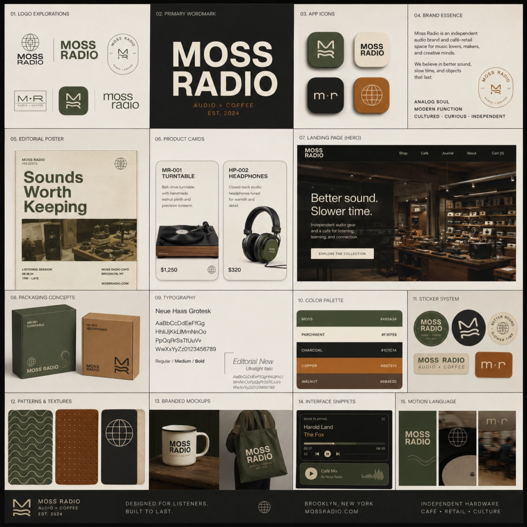
Create a square high-end brand identity showcase board for a fictional brand called "Moss Radio". The brand should feel analog, cultured, warm, tactile, and design-forward. It operates in independent audio hardware and café-retail and should appeal to creative professionals and music obsessives. The overall mood should be nostalgic but modern. Design a polished modular grid of multiple tiles, each showing a different application of one cohesive visual identity system. Include logo explorations, wordmarks, app icon variations, editorial posters, product cards, landing page fragments, packaging concepts, typography specimens, interface snippets, color palette presentations, sticker systems, patterns, branded mockups, and small motion-inspired compositions. Use Swiss-inspired typography, rounded industrial shapes, and a moss green / parchment / charcoal / copper palette. Dense but elegant layout, sharp alignment, strong hierarchy, premium case-study presentation.
One tweak to try: Replace “Moss Radio” with your brand name. Change the industry description to yours. Update the color palette. The model does the rest.
7. The character expression grid
Best for: illustrators, game designers, content creators working in anime or character-based formats.
This gpt image 2 prompt asks the model to hold one character consistent across 16 different emotional states. Same face, same hair, same outfit — 16 different expressions in one image. Character consistency across outputs is something earlier models struggled with badly. This is a good way to see how far things have moved.
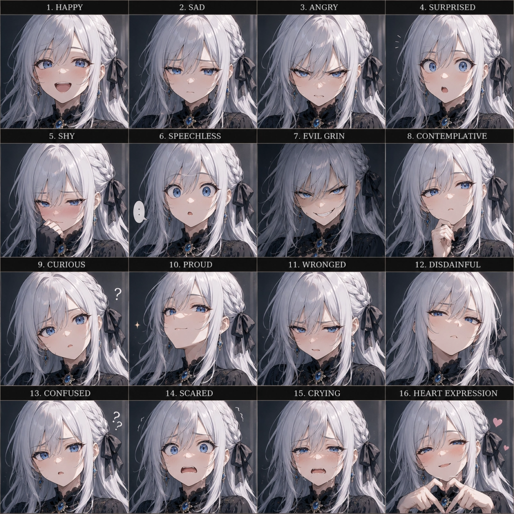
Create a 16-panel expression grid of a silver-haired, blue-eyed anime girl. Her face shape, hairstyle, and clothing must remain highly consistent across all panels. The 16 expressions should include: happy, sad, angry, surprised, shy, speechless, evil grin, contemplative, curious, proud, wronged, disdainful, confused, scared, crying, and a heart expression.
One tweak to try: Change the physical description and swap in whatever expressions fit your character or use case. This works for original characters and non-anime styles too — just describe the art style you want at the end of the prompt.
The one thing that matters most with gpt image 2 prompts
Specificity. That’s it.
The model makes decisions when you leave things vague, and those decisions are usually safe, generic, and boring. When you tell it what the image is for — a product ad, a magazine cover, a brand board — it uses that context to make better choices about framing, lighting, and layout without you having to spell all of it out.
A vague gpt image 2 prompt gives you something usable. A specific one gives you something you’d actually post.
What’s next
Part 2 of this series covers infographic and data visualization prompts — the ones that are actually useful for knowledge workers who need to make reports and presentations look better without a designer.
If you tried any of these, drop your output in the comments. Seeing what different people do with the same starting prompt is half the reason to do this.
👉 Claude Design Tutorial: Build A Social Media Dashboard
👉 How to Give Claude Code Social Media data
👉 Claude Code Tutorial for Beginners – Setup Guide
Every "app ideas" list recycles the same five: an AI chatbot, a habit tracker, a budgeting app, a…
A $60 billion acquisition, a shadow-deployed model, a nudifier ban, and $293 million into agent guardrails. The industry…
6 Best AI tools for business growth in 2026 I genuinely don't know how anyone expects solo founders…